


The Edit · Texture and reflection
Material Contrast
A palette can hold together while surfaces behave differently in light. Compare contrast deliberately, one relationship at a time.
Request Finish Samples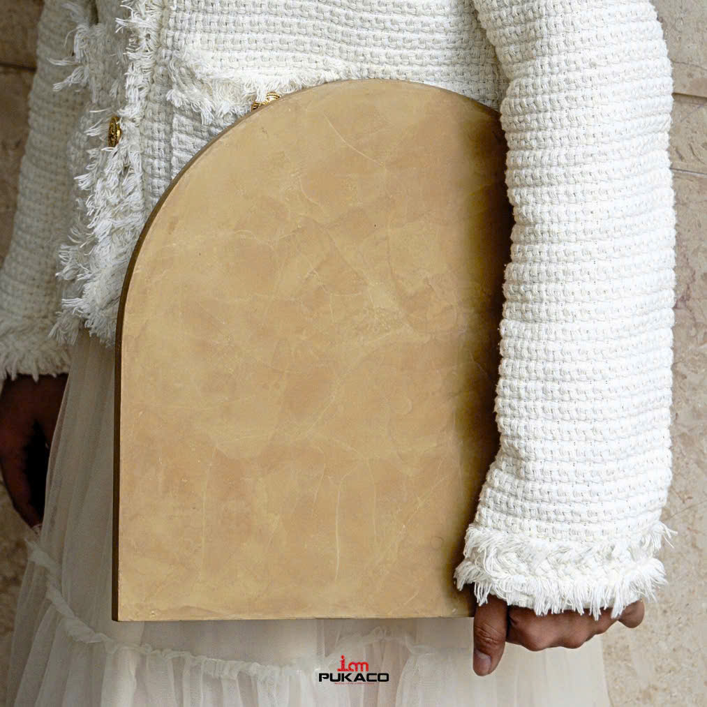
References to explore
Put three references in conversation.
Start with a concrete-effect reference, a Silk-effect reference and a Liquid Metal reference. Compare the actual samples to decide how much contrast your setting needs.
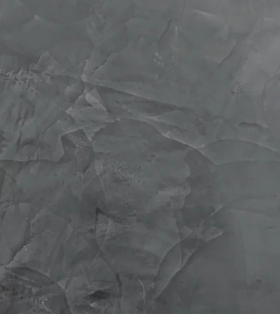

Editorial comparison only. Review color, texture and reflection with physical samples; confirm the finish system for the intended application.
Open your material board01
Hold one decision steady
Choose a color direction or anchor material first. Then compare the texture or reflection of the finish samples against that constant.
02
Compare effects without losing the product reference
Explore different PUKACO product lines across the same brief. Keep the product line, effect or series, and code on every sample note so a visual comparison stays connected to the material inquiry.
03
Describe the result you want
Note whether the contrast should be subtle across a room or evident at close range. Include the observation with your sample inquiry.
Explore a Reflection StudyContinue the conversation