

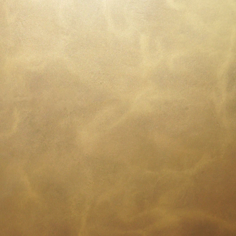
Palette study
Depth & Reflection
An editorial approach for exploring the role of surface texture and reflected light alongside color.
Request Finish Samples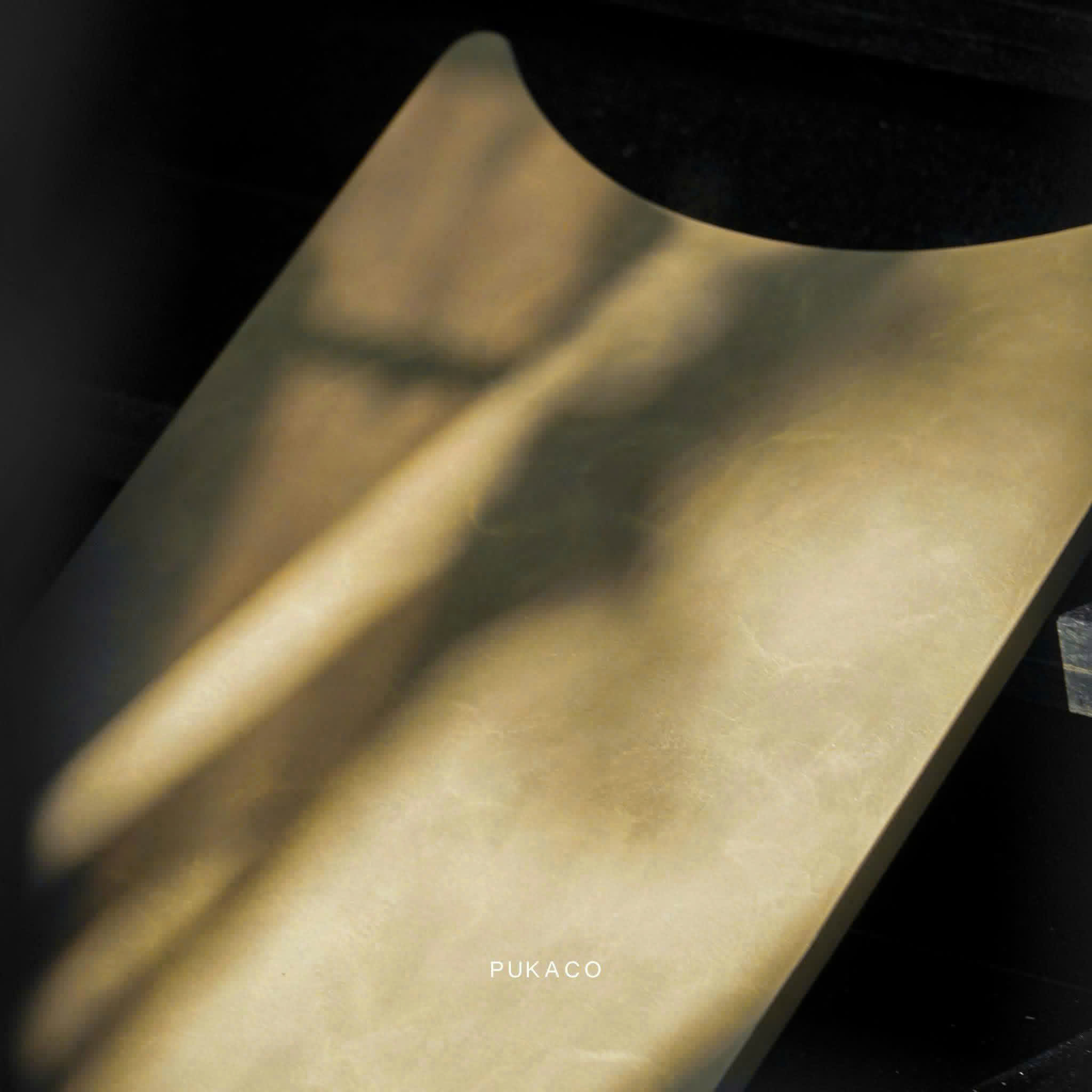
References to explore
Compare these references under the same light.
A gold direction, a gray direction and a blue direction. Keep the lighting and nearby materials consistent while you review each physical sample.
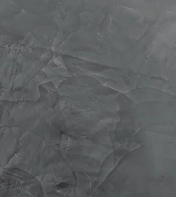
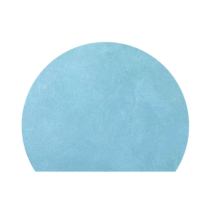
Editorial comparison only. Review color, texture and reflection with physical samples; confirm the finish system for the intended application.
Open your material board01
Choose the relationship
Decide which material is the visual anchor and which surface should provide contrast. Compare the samples together before judging either one on its own.
02
Observe more than one view
Look from the directions relevant to a wall plane or furniture form. Record the view and lighting condition when a comparison changes your preference.
03
Translate the study into a brief
List the exact finish codes you want to evaluate and describe the intended substrate. Keep the palette name as a project note, not a substitute for the material references.
Explore FinishesContinue the conversation