
The Edit · Palette building
Color in Depth
A color direction becomes more useful when it includes the surface texture and the materials around it.
Explore the Finish Library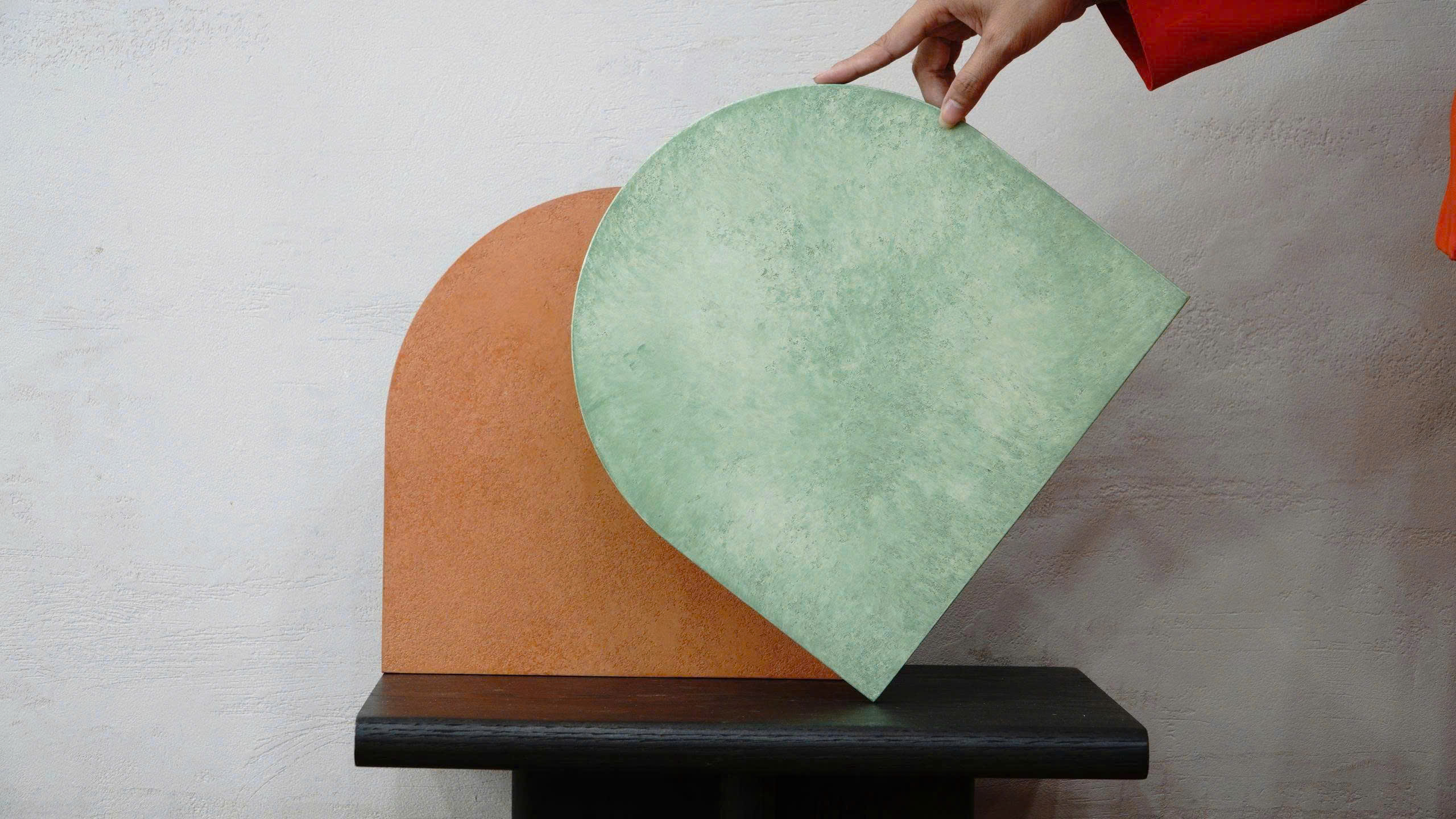
References to explore
Build a small comparison.
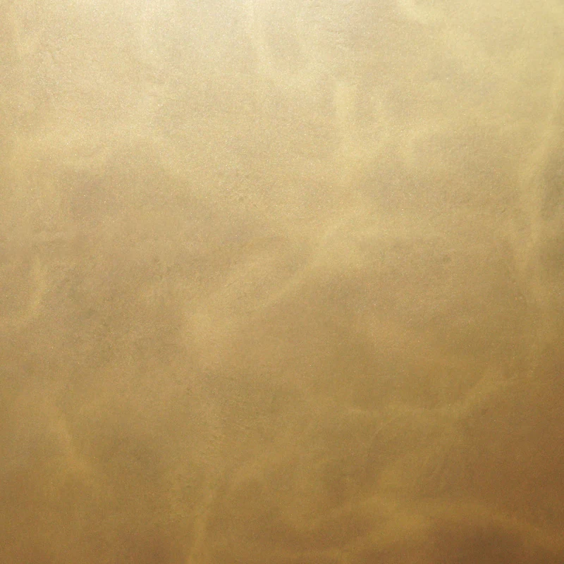
Explore a gold, a gray and a blue direction. These are separate references to consider, not a prescribed matching palette.
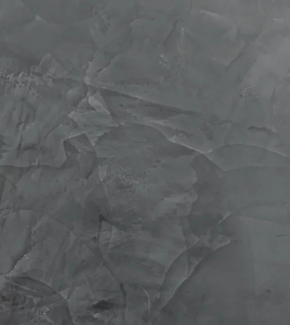
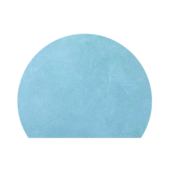
Editorial comparison only. Review color, texture and reflection with physical samples; confirm the finish system for the intended application.
Open your material board01
Compare a small set first
Begin with a focused shortlist rather than a large collection of unrelated samples. Label the preferred direction and the alternatives.
02
Keep color and finish separate in the discussion
Two samples can share a color direction while presenting different textures. Record which quality you are selecting so the next person reviewing the scheme understands the decision.
03
Review the palette across applications
Consider how the selection relates to both the wall plane and the furniture forms. Each application can use the same library while bringing its own substrate questions.
Explore Color & PalettesContinue the conversation